

Styling
The SDK uses color attributes that you define in the ASAPP theme, as well as extra style configuration options that you set via the style configuration class.Themes
To customize the SDK theme, extend the default ASAPP theme in yourstyles.xml file:
You must define your color variants for day and night in the appropriate resource files, unless night mode is disabled in your application.
asapp_primary to be your brand’s primary color, and adjusting other colors when necessary for accessibility. The system uses asapp_primary as the message bubble background in most buttons and other controls. The screenshot below shows the default theme (gray primary - center) and custom primary colors on the left and right.
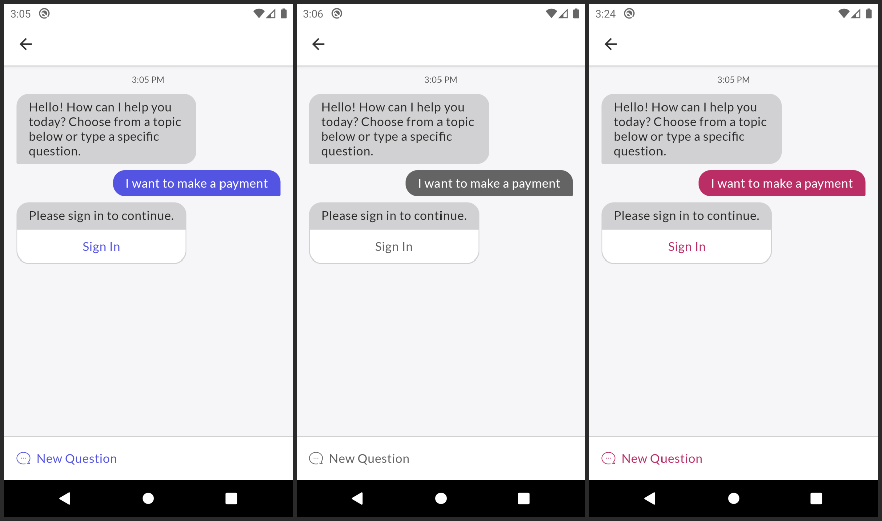
asapp_on_background and asapp_on_primary. Other elements that might appear in front of the background use asapp_on_background. Text and other elements that appear in front of the primary color use asapp_on_primary.
More Colors
Besides the colors used for themes, you can override specific colors in a number of categories: the toolbar, chat content, messages, and other elements. You can override all properties mentioned below in theASAPPTheme.Chat style.
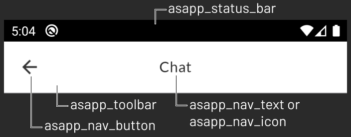
The status bar color is asapp_status_bar and toolbar colors are asapp_toolbar (background), asapp_nav_button, asapp_nav_icon, and asapp_nav_text (foreground).
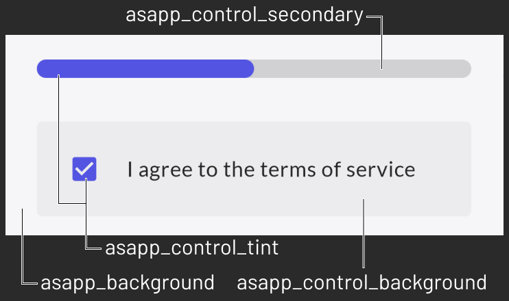
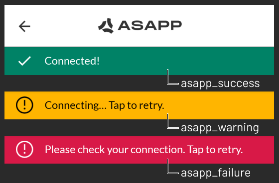
asapp_backgroundasapp_separator_colorasapp_control_tintasapp_control_secondaryasapp_control_backgroundasapp_successasapp_warningasapp_failure
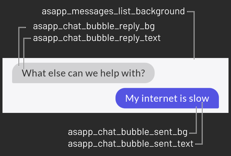
asapp_messages_list_backgroundasapp_chat_bubble_sent_textasapp_chat_bubble_sent_bgasapp_chat_bubble_reply_textasapp_chat_bubble_reply_bg
Text and Buttons
To customize fonts and colors for both text and buttons, use theASAPPCustomTextStyleHandler. To set this optional handler use ASAPPStyleConfig.setTextStyleHandler. Use the given ASAPPTextStyles
object to:
- Set a new font family with
updateFonts. If you set no new fonts, the system uses the default instead. - Override font sizes, letter spacing, text colors, and text casing styles. You can also customize the font family for each text style individually, if needed.
- Override button colors for normal, highlighted and disabled states.
ASAPPTextStyles to see all overridable styles.
The system calls
setTextStyleHandler when it creates an ASAPP activity. Use the given Context object if you access resources to make sure that all customization uses correct resource qualifiers.For example: if a user is in chat and toggles Night Mode, the SDK automatically triggers an activity restart. Once the system creates the new activity, the SDK calls setTextStyleHandler with the new night/day context, which retrieves the correct color variants from your styles.Chat Header
The chat header (toolbar in the chat activity) has no content by default, but you can add text or icon usingASAPPStyleConfig.
Text Title
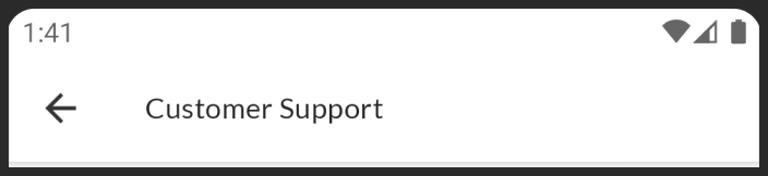
To add text to the chat header, pass a String resource tosetChatActivityTitle. By default, the system aligns the title to start. For example:
Drawable Title
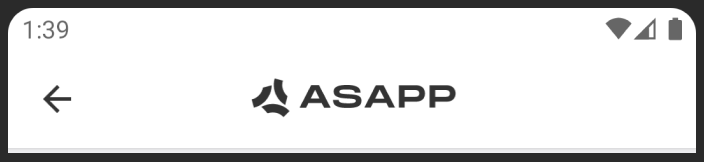
To add an icon to the chat header use:setChatActivityToolbarLogo. You can also center the header content by calling setIsToolbarTitleOrIconCentered(true). For example:
Dark Mode
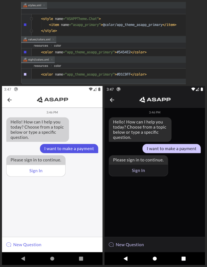
Android 10 (API 29) introduced Dark Mode (a.k.a night mode, dark theme), with a system UI toggle that allows users to switch between light and dark modes. ASAPP recommends reading the developer documentation for more information. The ASAPP SDK theme defines default colors using the system resource “default” and “night” qualifiers, so chat will react to changes to the system night mode setting.The ASAPP SDK does not automatically convert any color or image assets in Dark Mode; you must define night variants for each custom asset as described in Android >Styling>Theming.
Disable or Force a Dark Mode Setting
To disable Dark Mode, or to force Dark Mode for Android API levels below 29, ASAPP recommends using the AppCompatDelegate.setDefaultNightMode AndroidX API. This function changes the night mode setting throughout the entire application session, which also includes ASAPP SDK activities. For example, it is possible to use Dark Mode on Android API 21 with the following:Atomic Customization
To customize the styles at an atomic level, you can use thesetAtomicViewStyleHandler to update viewStyles. Customizing at the atomic level will override any default style that is being set on the UI views. Use it only if general styling is not sufficient, and you need further customization. This is optional, and in most cases, you won’t need it. Use with caution.